Global warming timeline – interactive This feature presents an interactive timeline of global warming – from 10,000 BC through to the present day, with future warming pathways to 2100.
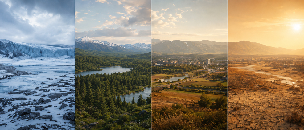
The average surface temperature of planet Earth has varied greatly throughout its history. In the early Hadean, around 4.5 billion years ago, the young Earth was an unstable and extremely hostile place, dominated by vast regions of molten rock, with temperatures far above anything seen today. Later in that eon, however, the planet cooled enough for water vapour to condense, rain to fall, and the first oceans to form. Much later, Earth swung between other extremes. During "Snowball Earth" episodes, most famously in the Cryogenian Period roughly 720–635 million years ago, ice may have extended from the poles to near the equator. During parts of the dinosaur age, by contrast, Earth entered "hothouse" climates with little or no permanent ice, and sea levels far higher than today. Around 21,000 years ago, during the Last Glacial Maximum, global average temperatures were about 6°C cooler than today. Ice sheets covered much of northern North America and northern Europe, while sea levels plunged 120 metres lower than at present. Those lower seas exposed land that no longer exists. One of the most striking examples was Doggerland, a low-lying region that connected Britain to mainland Europe across what is now the southern North Sea. Its rivers, wetlands, lagoons, marshes, and coastlines would have provided a rich environment for hunter-gatherer tribes. As the climate warmed and ice sheets melted, rising seas gradually flooded this landscape, cutting Britain off from the continent and leaving Doggerland submerged beneath the North Sea. The retreat of the ice sheets marked the beginning of the Holocene, the geological epoch in which all recorded human civilisation has developed. Over several thousand years, the global climate became relatively stable. This helped agriculture to spread, populations to grow, cities to emerge, and written history to begin. Regional climates still shifted, but the global average temperature varied within a narrower range than during the glacial cycles that came before. The interactive graph shown here begins at 10,000 BC, in the earliest part of the Holocene. As can be seen, a slight long-term cooling trend emerged after the initial period of rising temperatures, continuing from roughly 4,000 BC until the modern era. Natural factors, including changes in Earth's orbit, solar variability, volcanic activity, and ocean circulation, all played roles in shaping the climate. These changes unfolded slowly compared with what has happened since the Industrial Revolution.
The speed of modern warming is what makes the present era so unusual. Recent global warming has occurred at least 10 times faster than the long warming period that followed the last ice age. Within the period shown in this graph, the contrast is even sharper: the modern rise is roughly 70–80 times faster than the slower warming near the start of the Holocene. Human activity is raising atmospheric carbon dioxide – the greenhouse gas most responsible for global warming – 250 times faster than natural sources did after the last ice age. Changes that once took millennia now unfold within decades. Humanity's collective emissions of carbon dioxide increased sharply from the early 19th century onwards, as coal, oil, and gas powered the Industrial Revolution and the development of modern society. By the end of the 19th century, our annual carbon dioxide emissions from fossil fuels had exceeded 1 gigatonne. Scientists began to understand the underlying physics long before modern climate change became obvious. In the 1820s, French mathematician Joseph Fourier argued that Earth's atmosphere helped retain heat, keeping the planet warmer than it would otherwise be. In 1859, Irish physicist John Tyndall showed that gases such as water vapour and carbon dioxide absorb infrared radiation. In 1896, Swedish scientist Svante Arrhenius went further, calculating that changes in atmospheric carbon dioxide could alter Earth's surface temperature. By 1912, this idea had even reached the popular press, with Popular Mechanics noting that coal burning added carbon dioxide to the atmosphere and could make the air function as a more effective heat-trapping blanket. During the post-war boom after World War II, economic growth and energy demand accelerated dramatically. The global population soared into the multi-billions, car ownership exploded, air travel became common, and vast industrial systems reshaped the land, oceans, and atmosphere. In the early 21st century, emissions growth shifted increasingly towards Asia, as China underwent an extraordinarily rapid phase of industrialisation, urbanisation, coal-powered electricity generation, steel and cement production, and export-led manufacturing. China overtook the United States as the world's largest annual emitter in the mid-2000s, while other emerging economies also expanded their energy use as populations and living standards rose. The global population passed 8 billion in 2022, adding further demand for housing, transport, electricity, food, and materials. Although clean technologies began growing rapidly, fossil fuels continued to supply much of the energy behind this expansion, keeping atmospheric carbon dioxide on an upward path. The result is visible in the modern section of the graph above. While the annual observed temperature records fluctuate from year to year, the long-term direction is unmistakable. The 5-year trailing average smooths out short-term noise from events such as El Niño, La Niña, and volcanic eruptions, making the underlying trend even clearer. This graph includes six major temperature datasets – Berkeley Earth, ERA5, GISTEMP, HadCRUT5, JMA, and NOAAGlobalTemp. These records use different methods and data sources, but all show the same broad pattern: a modest rise in the late 19th and early 20th centuries, followed by a much steeper increase from the late 20th century into the present day. Natural causes cannot explain this modern trend. Solar output has not increased in step with global temperature, and the upper atmosphere has cooled while the surface and lower atmosphere have warmed – precisely the pattern expected from greenhouse gases, not a stronger Sun. Volcanoes release carbon dioxide too, but only a tiny fraction of the amount produced by human activity. Water vapour, another powerful greenhouse gas, acts mainly as a feedback: warmer air holds more moisture, which then amplifies the warming already underway. Scientists can also trace the source of the extra carbon dioxide. Fossil fuels contain carbon with a distinctive isotopic signature, depleted in carbon-13 and almost entirely lacking carbon-14. As fossil fuel use has increased, scientists have detected the same changing ratios in the atmosphere, confirming that the rise in carbon dioxide comes mainly from ancient carbon released by human activity.
The most recent years have pushed global temperatures into unprecedented territory for the instrumental record. Copernicus, the Earth observation programme of the European Union, confirmed 2024 as the warmest year on record and the first calendar year to exceed 1.5°C above the 1850–1900 average. Its ERA5 dataset placed 2025 as the third-warmest year, only slightly cooler than 2023 and 2024. Meanwhile, the World Meteorological Organization, drawing on a consolidated analysis of nine international datasets, found that 2015–2025 were the 11 warmest years on record. Future warming will depend on the choices that societies make in the coming decades. The graph includes Shared Socioeconomic Pathways, or SSPs, which the Intergovernmental Panel on Climate Change (IPCC) uses for its projections. These are not firm predictions, but scenarios showing how temperatures could evolve under different assumptions about emissions, land use, technology, energy systems, and climate policy. Lower pathways, such as SSP1-1.9, assume rapid emissions cuts and a transition away from fossil fuels, giving a better chance of limiting long-term warming. Middle and higher pathways, such as SSP2-4.5 and SSP5-8.5, show progressively greater warming if emissions remain high for longer. These scenarios help illustrate the scale of the choices ahead. Each additional tenth of a degree matters: for heat exposure alone, one study estimates that every 0.1°C of extra warming could place around 140 million more people in dangerously hot conditions, while every avoided fraction reduces the pressure on lives, food, water, ecosystems, and economies. Despite rapid growth in solar power, wind power, batteries, electric vehicles, and other clean technologies, the world has not yet reduced fossil fuel use fast enough to halt the rise in atmospheric greenhouse gases. The longer emissions remain high, the harder it becomes to keep warming below 2°C, a threshold beyond which climate risks become far more severe, adaptation becomes much more difficult, and long-lasting or irreversible changes are more likely. The importance of this interactive timeline lies in its sense of scale. Over thousands of years, the Holocene appears as a period of relative climatic stability. In the modern era, that stability gives way to a sudden upward spike. The next few decades will determine whether that spike begins to peak and fall, or whether it leads to a hotter, more dangerous world that threatens to overwhelm the natural and human systems on which civilisation depends.
Sources: Holocene global mean surface temperature, a multi-method reconstruction approach, Scientific Data: Data Overview / High-Resolution Global Monthly Averages (Experimental; 1850 – Recent), Berkeley Earth: C3S_Bulletin_temp_202512_Fig1b_timeseries_anomalies_ref1991-2020_global_allmonths_DATA.csv, European Centre for Medium-Range Weather Forecasts: GISS Surface Temperature Analysis (v4) / Global-mean monthly, seasonal, and annual means, 1880-present, updated through most recent month, NASA: Met Office Hadley Centre observations datasets / HadCRUT.5.1.0.0 analysis / HadCRUT5 analysis time series: ensemble means and uncertainties / Global (NH+SH)/2 – Annual, Met Office: Annual global series, 1891–2025, Japan Meteorological Agency: Global surface temperature v6.1 time series, NOAAGlobalTemp (NOAA): "For every 0.1°C of warming above present levels, about 140 million more people will be exposed to dangerous heat."
Posted: 9th May 2026. Last updated: 9th May 2026.
If you enjoy our content, please consider sharing it:
|